Sunday, September 30, 2012

cups with handle journal entry by Haemi Jung


  These two cups are made by Eric Rempe. Personally, I really like his cups. In his cup, he used unique colors and design. Upper side cup has organic shape and it looks like a human body somehow. And the other one has silver color and some organic decoration on it with different color. Both of cups have unique shape of lip. I am not sure that it is okay to drink with it or not but I think that both cups look really nice


This cup is made by Linda Arbuckle. This cup’s name is water-cup-dark-lotus. I really like her decoration drawing and color on the cup. Lotus looks so beautiful. If I drink tea with this cup, it feels like tea with water in the cup. Also, handle looks comfortable.


This cup is made by Ted Vogel. I think that this is not that work well with functionally but it is very creative and decorative. This cup’s name is Stump cup. We can see the face on the left side and bird is sitting on the cup’s lip and I guess that bird trying to drink water from the cup. Also, handle exist on the right side but I am not sure that handle will work well.


Drinking Vessels by Ting Yi Yu

Artist: Ayumi Horie 
"Monkeys Cup"
This is my favorite "Monkeys Cup"(19floz)
I love the shape of the cup with the cute monkey illustration. I notice that the artist used the glaze first then use something sharp maybe needle to draw the monkey. Also, the I can tell how comfortable of the handle will be by looking the shape.   


Here is the closer look of the monkey.

 Artist: Ayumi Horie 
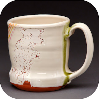
 "Rabbit and Raccoon Cup"
Here is another cup "Rabbit and Raccoon Cup"

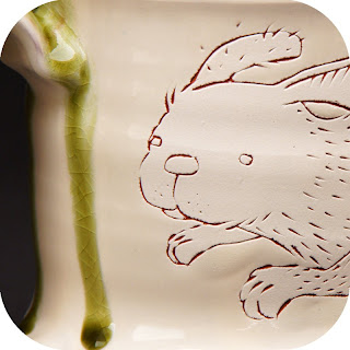
closer look of the rabbit.

 Artist: Linda Arbuckle 
Sunflower Cup with Striped Top
I like the flowery style of the cup and the color she used in this cup. This can even be a small vase because it give people feeling of alive.
Artist: Linda Arbuckle 
 Tankard: Wisteria
The white/ green little cap thing on the handle drags my attention.
compared with the cup "Sunflower Cup with Striped Top" which Tankard has wider feet.

Artist: Hamada Shoji
Drinking Bowl
This one doesn't have handle but I like the cool color on the out side of the cup which has shining purple/ brown in the lips.

 Artist: Tara Wison
 Artist: Tara Wison
The last two are made by Tara Wison
for the two brown tea cups- the lips has the white-green glaze on it and the holders looks like pillows to me. I would like to use this cup to drink during the winter time.

Saturday, September 29, 2012

Cups-Meara LaFrance

Andrew Gilliat created these cups, I really enjoy the unique shape that hes created. They appear as though they would be comfortable to hold
and drink from. They are very smooth and clean, something that I normally strive for in my own work. I believe that Andrew uses molds to create these cups but they could be thrown and altered to look similar. The surface decoration is also appealing to me, and in somewhat of the same direction that I wish to take my work.


These cups are by David Eichelberger. Again the imagery on the outside of these cups caught my eye, the handles are small but well placed, I also like the simple lines hes drawn on these cups.


Nan Coffin made these simple tumblers. Ive always really enjoyed the orange and grey color scheme on pots, its matched beautifully with a light blue glaze on the interior. The design on the exterior of the cups is nice as well.


This is also Nan Coffin its called "Kicked Back Cup" which I thought was clever. I like the colors and again the clean simplistic style.


    These Cups were created by Tara Wilson, Im envious of the way she can so gracefully manipulate the clay leaving it in an array of beautiful shapes with clean surfaces. I had the opportunity to watch her work last year when she came to our school, she was wonderful. The handles and curves of these cups is what attracts me the most as well as the colors.


Thursday, September 27, 2012


I looked through several different artists and chose some of the pieces that I liked. Out of all of the pieces I looked at, I only selected one par of cups, but I wasn't really looking for cups anyways.
Chris Stanley image This piece was “untitled bowl”, these to bowls remind me of finger painting by the lines left on their walls. Not really something I would keep in my kitchen because of how narrow the foot is in comparison to the diameter of the opening. This might not be a problem to most people but I live with clumsiness. Also I'm not really sure of the actual size, but to me they look good enough to drink out of.
Ayumi Horie image The gorilla is what was asking me to grab this piece. The fatness of his face is very welcoming along with the thin lines used to draw him. I also like the line of sight coming from the bird’s eye that connects with the head of the gorilla. It kind of makes me wonder if the gorilla did this on purpose as if to tell me I am more important than the bird. What ever the case, thank you gorilla.
  This piece is from Tara Wilson under "drinking vessels". The pair was chosen more for the pillows supporting the cups rather than the cups themselves. These would be perfect for drinking sleepy time tea right before going to sleep, or for a picnic by the river.

Wednesday, September 26, 2012

Cups Journal Entry -Kelsee Franz


Drinking Vessels 
Tara Wilson "Drinking Vessels"

The artistic flare that encompasses these drinking vessels, can only be described as lovely pieces of art. In such forms as Tara Wilson's Drinking vessels the firing kiln does most of the color work, which is completely random. This technique really gives each cup a unique look and design. What makes them unify with each other is the lovely shape. with the narrow bottom with the over sized lip, enlarging up towards the bulge in the middle, curving in like a lovely waist at the near top then flowing out for the final slight curve. Curves like this almost give the cup a human feeling, by being sultry and curvaceous and soft looking. Tara's cups makes you want to pick them up and hold them. That is why I picked this set from her gallery to share here.  


Linda Arbuckle "4 Seasons"

The thing that I love about Linda Arbuckle's 4 Seasons, is the flat rim with the tapering base. But my absolute favorite thing about this cup is the handle! I adore the extra little flare out that allows the drinker to relax the rest of their fingers into that little crevice. I've always loved cups that do this and just the fact that its so bright and cheerful makes me want to sit outside in the sunshine with a glass of tea.

Ayumi Horie "Deer Cup"

I enjoy the human touch of Ayumi Horie's cups and mugs; that paired with her unique drawing style of animals gives her cup series a lovely antique feeling. I also enjoy the minimalism of color, but still the slight hint of it within the deer's antlers to help bring back interest to the head of the cup. her handle also looks interesting, and i'm curious as to what it would feel like to hold. (and for only 66$ on her website I can!)


Written by Kelsee Franz


Cup Journal Entry - Troy Lynn Hamzy

Chris Stayley
This set looks like it belongs perched on a lily pads in a pond. Just fits right in with nature. They look as if a fairy will appear at any moment to sprinkle sugar. Absolutely gorgeous. I love they way they shine like glass. The colors are lively and whimsical just the way I like it.


Clary Illian
I had to go and look at Clary's work after hearing Professor Robison talk about his time spent learning from her. I usually wouldn't be attracted to these earth tones, I like the brighter colors, but I just want to touch these mugs. They look like they would feel not only comfortable but like a treat in the hand, with the angles. I like the foot on the red one, too.


Deborah Schwartzkof
These mugs caught my eye and I would be interested to see how they feel in the hand. I guess this is just to make me feel better when I spin some crooked cups! It's art, man!


Linda Arbuckle
I really like all of her work. She uses color the way I would like to learn to use color. I also like the bloated bottom to hold more liquid, but a narrower top to keep it warm longer.


Linda Christianson
This is the effect that has always captured my interest for pottery. THE GLAZES! Must have bright shiny glazes. Also, interesting how the base rips away at the top of handle.