Wednesday, September 26, 2012

Cups Journal Entry -Kelsee Franz


Drinking Vessels 
Tara Wilson "Drinking Vessels"

The artistic flare that encompasses these drinking vessels, can only be described as lovely pieces of art. In such forms as Tara Wilson's Drinking vessels the firing kiln does most of the color work, which is completely random. This technique really gives each cup a unique look and design. What makes them unify with each other is the lovely shape. with the narrow bottom with the over sized lip, enlarging up towards the bulge in the middle, curving in like a lovely waist at the near top then flowing out for the final slight curve. Curves like this almost give the cup a human feeling, by being sultry and curvaceous and soft looking. Tara's cups makes you want to pick them up and hold them. That is why I picked this set from her gallery to share here.  


Linda Arbuckle "4 Seasons"

The thing that I love about Linda Arbuckle's 4 Seasons, is the flat rim with the tapering base. But my absolute favorite thing about this cup is the handle! I adore the extra little flare out that allows the drinker to relax the rest of their fingers into that little crevice. I've always loved cups that do this and just the fact that its so bright and cheerful makes me want to sit outside in the sunshine with a glass of tea.

Ayumi Horie "Deer Cup"

I enjoy the human touch of Ayumi Horie's cups and mugs; that paired with her unique drawing style of animals gives her cup series a lovely antique feeling. I also enjoy the minimalism of color, but still the slight hint of it within the deer's antlers to help bring back interest to the head of the cup. her handle also looks interesting, and i'm curious as to what it would feel like to hold. (and for only 66$ on her website I can!)


Written by Kelsee Franz


Cup Journal Entry - Troy Lynn Hamzy

Chris Stayley
This set looks like it belongs perched on a lily pads in a pond. Just fits right in with nature. They look as if a fairy will appear at any moment to sprinkle sugar. Absolutely gorgeous. I love they way they shine like glass. The colors are lively and whimsical just the way I like it.


Clary Illian
I had to go and look at Clary's work after hearing Professor Robison talk about his time spent learning from her. I usually wouldn't be attracted to these earth tones, I like the brighter colors, but I just want to touch these mugs. They look like they would feel not only comfortable but like a treat in the hand, with the angles. I like the foot on the red one, too.


Deborah Schwartzkof
These mugs caught my eye and I would be interested to see how they feel in the hand. I guess this is just to make me feel better when I spin some crooked cups! It's art, man!


Linda Arbuckle
I really like all of her work. She uses color the way I would like to learn to use color. I also like the bloated bottom to hold more liquid, but a narrower top to keep it warm longer.


Linda Christianson
This is the effect that has always captured my interest for pottery. THE GLAZES! Must have bright shiny glazes. Also, interesting how the base rips away at the top of handle.

Wednesday, March 7, 2012

Buss #3

Hans Borgonjon
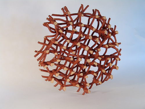
Filigree Crown
10x15x15

This piece is beautiful and I wish I had actually done this assignment on time.  As Steve says "If you're not cheating, you're not trying."  So.  With that introduction, I'd like to say, again, this piece is breathtaking.  I can imagine wearing this as a crown, how heavy it might, or might not be.  It would probably not fit on my head, but would be around my neck.  I like that you can see where the clay sagged from the weight of the clay above it on the bottom right hand side of the photograph.  From experience, this type of work doesn't like to stick together that well!!  I am impressed.

Brian Harper
Oscillation
Ceramic, Epoxy
5.5" x5.5"x 18"

I think that for me, more than anything, is the display of this piece.  I want to be inside that spotlight, in front of that window, in the center of those tangles of ceramic.  I'd like to stretch my hand and arms through the loops and see how the clay feels on the soft skin of the inside of my arm.  I feel like I could meditate in this space, perhaps even with people watching because it feels like a nest, and it feels protected to me.

Lizzie Charboneau: Number 3


Ryan LaBar’s work looks like it is a pile of trash or bits of metal pieced together. However, He has taken large objects made of porcelain and pieced them together in a jumbled way that makes sense and have meaning. He makes abstract shapes, and realistic looking objects like gears, knobs and chains. His compositions often look like a mess and that they are random, but once you read the title, it is more understandable. I feel that this can hinder and help his mission. As a viewer, I was first put off by his work because it didn’t make sense. I was like okay… so he painted gears and warped them and fit them together… great… what is the purpose of this? But after looking at the title of some things, like “Just Don’t Let a Panda Borrow Your Bicycle,” I see the humor and the correlation between the color, shape, and objects in the compositions. I like that he puts a bit of humor in his work, because, let’s be real… you really shouldn’t lend you r bike to a panda bear, but seeing his display of a completely jumbled up bicycle, clearly states why you really shouldn’t let a panda bear borrow your bike, because it would end up looking like this.
As I look through the pictures of his work more, it makes me want to see them in person more and more. The way he positions the piece and the objects within the piece make me want to walk around it, flip it over, look all over it and try to find a treat in it or something. I like that in some works he has perfect geometrical shapes, like cones or tubular circles, and then in others he warps common objects like gears and other mechanical objects.
I am a dancer, and always end up looking at artwork and objects in a form of a dance. Some of his work I find very appealing because I can see the dance that was done in creating the object, and the dance that would be the result of following the rhythm and the movement of the piece. One that I am drawn to in particular is “Jazz Tinged with Sorrow as well as Somber Beauty.” The thick, flowing, black strips of the piece seem like the movement of a dancer as she or he swirls and pushes and pulls to the slow, somber music. The irregularity of the movement seems to work its way around the space like the body of a dancer and contracts into itself in places that I would put a move that has the dancer pull into their body.

Lizzie Charboneau: Number 2


Lesley Baker’s work consists of some pieces that I wish I would have had the guts to make. I have always liked being a “girly girl” and wish that that would have been able to come out in my work more. I have always had a feeling that flowers and hearts on work is “cheesy,” however, Lesley was able to take these things and make them very pretty and some great looking art. 

One of my favorite pieces is the Flower House. It is such a simple looking form and structure, but knowing how clay works and after looking at the structure, I can see that it can be hard to put together, and it makes me appreciate her for her work (I can see this is many of her other pieces as well.) I like that in her work like the flower house, she puts detail in ever inch. The print she has on the flowers is visible on both inside and outside of the flowers, and even on the base as well. I like that the flowers seem to be uniform, but have an organic, unique quality to them.  Another one of Lesley’s pieces I like is the Wall of Sight. The forms she uses are interesting and both something I have never seen before, and something that seems familiar and organic. I really like that her forms seem to be able to work as one object, and fit together to make one big piece at the same time, it is something I think can work really well in a piece or work against it. I think that this works for her, because you can't really tell that they are all smaller pieces that fit together to make one piece. This is also seen in her piece, Fly on the Wall.
 I feel that Lesley Baker has an ability to make things so mainstream and, in a way, cheesy, and make them into very…pretty pieces of art work that give an air of simplicity and elegance as well. 

Tuesday, March 6, 2012

Kevin Anderson


Kevin Anderson

The following artists have a flare for complexity.  It takes an abundance of patience to deal with clay and get the final product to reflect what was intended.  First, is Hans Borgonion.  I have secured two examples of his work, and the first is “Microtubuli XL”, 2008. It is an extruded tube of clay which is then handbuilt to get this beautiful design.  I am drawn to this piece because the natural organic look that he was able to achieve is amazing.  The handling and delicacy required to pull this off is quite a task.

The second example of Hans Borgonion is “Microtubuli x4”, 2008. which was again hand built from extruded clay structures.   I am again pulled to this piece based on the complexity and design component which incorporates two different clay bodies to add a broadening depth  from particular angles.  I also look at this and see an interracial political statement.  It’s nice when a piece just from being viewed can invoke an emotional response.


The Second Artist dealing with many complexity issues is Ryan LaBar.  At the first glance of the photos, I thought these pieces were quite small and how was he able to get them to look so amazing?  But further investigation shows that these pieces are quite large and spacious.  This however still makes you wonder where he was able to get these fired.  Perhaps a very large kiln somewhere.  The first piece is titled “In Chaos, A Moment’s Repose”, 2011.  This stood out to me with his lack of color throughout most of the piece.  The lack of right angle and perpendicular lines gives a sense of flow and endless curvature.  The shadows add to the drama of the piece and the title gives you a glimpse into the artists ideals. 

The second piece I chose was “Anything Can Happen, and Usually Does”, 2010 also produced by Ryan LaBar.  In this one, the colors and trim lines give me a feeling of a ‘system’ that is being propogated.  I look at this and see many parts of life all working together for a common end.  Looks like a mess and that goes well along with the title of the piece.  The color choices are also interesting as many people associate many colors to different emotions.  All together this piece looks like it was well thought out and executed.  This artist is the most impressive I have seen so far.