Thursday, February 23, 2012

White Basket. Victoria Christen. Red Earthenware, casting slip, underglazes, terra sigillata, 19x15x15, 2010.


Looking at Victoria Christen’s work is an obvious way to look at a coil-built form. Her form White Basket is made of thick coils stuck together on a vase-like shape. This piece has the ability to play with light because of all the open space in the form. It is also appreciated as a functional piece since it is able to hold objects and the holes are large enough to hold on to.


Resignation. Andrea Keys Connell. Earthenware, 2'x1.5'x1', 200.


Every artist should be familiar with the human anatomy. However, there are times when artists make a stylized version of the human figure. Andrea Keys Connell creates giant human figures and tends to make then more on the stout side. Despite that Resignation is not the best example of this; Connell’s pieces have so much character to them. Resignation was chosen as an example of a coil-built human torso.


The Infant II. Gabrial Parque. 20x11x12, 2011.


Gabrial Parque depicts baby/fetus-like features in his sculptures often partnered with Christian symbolism. What really intrigues me about these pieces, besides the choice in subject matter, is the detail Parque puts into them. The height of The Infant II is twenty inches and yet the details in the features of the infant’s body are so accurate; down to the wrinkles in the infant’s hands.


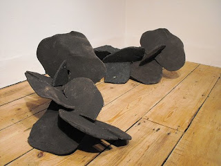
Untitled. Ryan LaBar. Porcelain, 2011.


The final piece here is visually stimulating. Ryan LaBar uses a unique style in creating his form. They appear to be a mesh of different sets of mechanical pieces that were molded with clay. The elements flow in a way a mechanical gear should never bend. To me it seems that LaBar never starts with a designed structure in mind, and yet the end result comes out to be beautifully balanced.

Wednesday, February 15, 2012

Kate Snyder: Assignment #3


I like how Ryan LaBar describes his work in his artist statement as “cascading failures”,
because it is a perfect portrayal. It is packed with chaos and looks like
gravity, or some universal force is causing it to tumble in on itself. The
objects in the pieces look as if they are suspended in space, as if to pause in
mid-destruction just to present itself to the audience. A lot of LaBar’s piece
have steampunk qualities to them.


John Chwekun’s work is structurally stressful just looking at it. Using such small and complex
figures to build one object that is meant to stand on its own is no easy task.
The different colors on the terra cotta give the piece a sense of organic
coloring, but not quiet skin like. Also, looking closely the slow progression
of the chimpanzees’ features as they progress further up the piece help the
audience understand that is symbolizes evolution.

Linda Casbon’s handbuilt piece called “Detail of Screen”, made from earthenware paperclay and steel, remind me of a mix between sea barnacles and seaweed. They are very organic
looking and the muddy green look of the glaze makes me think of things that
live in the ocean. Plus, the tubes look like octopus suction cups. Although, the
lines where the ceramic parts are connected easily seen.

Tuesday, February 14, 2012

Kevin Anderson


Both these examples top right and top left by Sam Chung show a great deal of line interpretation.  He uses different colors and widths in the lines to give the object a great deal of depth. It isn’t overly apparent which should be jumping out at you first, the color sections or the porcelain white.  And the black lines give visual depth as well.  The functionality of the pieces don’t appear to be very realistic, but the pieces are very appealing to the eye.


The other three pieces represented here are by Maren Kloppmann. They are particularly interesting to me again because of the lines used in the finish. I am drawn to wonder about the placement and size and obscurity of the lines. The subtle shifts in line placement really create a certain amount of confusion and make the piece much more appealing to the eye.


Monday, February 13, 2012

Jana Jasman: Assignment #3

Ryan LaBar

2009

Stoneware/Porcelain

What I found interesting by this piece that was created by Ryan LaBar was how complex and clean the ribbon-like sculpture looks. I like the many ways that the one shape was manipulated and created into one big piece. It looks really well done and put together. The mustard color yellow and white stripes that were used were appealing to me and look very nice together and I like that he didn't just use the one color. It makes it that much more interesting for me to look at. I like some of the negative space that was used also.

Hans Borgonjon

“Filigree Crown”

Porcelain

2009

I love how clean and simple this piece is. The white really pops out to me and reminds me of someone with obsessive compulsion disorder who is constantly cleaning and has those really white tile floors and walls in their house. I really like that clean look a lot. And the gold points at the top of the crown are a great contrast to the white. I think that makes the piece even better so that there is some color to make it more interesting and more appealing to look at for me. I just think that this piece was beautifully done.

This piece was also done by Hans Borgonjon and it is complete opposite from the clean and simple look of the crown. Its called "Black Dog". The texture isn’t as smooth and has a more rough quality to it. I really like the way the pieces were put together like a puzzle and the smokey color of the sculpture. I think that the size of the sculpture is nice because it makes the piece more appealing than just a small piece like the crown. I think it is because there isn’t any negative space like the crown has.


Brian Harper

This piece that was done by Brian Harper is very interesting and different from what I usually like. The size of the sculpture is huge and although I like smaller sculptures, I really like the size of it and it amazes me how clean and simple it looks but I know it couldn’t have been easy to make with all the twists that are in the piece. It appears to have some texture in it that I like, kind of reminds me of pipes that are rusting. It’s a very nice piece.

Lisa Ortman - Journal Entry #3


Ying-Yueh Chuang, Seed Creature, 19”x19”, 2000

I really like the way Ying-Yueh explores her ideas through clay, she is great at creating organic forms.   Her forms are unique and organic while also keeping symmetrical and asymmetrical forms.  I feel like this piece is so different and imaginatively interesting, that you could get lost in the forms, but instead it’s put together really well, the forms flow well together, and the colors look great.  I think this piece demonstrates a lot of the ideas we were taught this quarter, I couldn’t find the concept but I think it’s interesting enough without knowing. 

Sarah Gross, The Street Where You Live, 7.5”x15”x2.5”, 2010

Sarah says, “a screen divides spaces and unites it, seeing what lies on the other side invites the viewer in, and yet access is forbidden, I seek to activate space by building screens.”  These screens caught my eye for many reasons, but I especially like the attention she gave to texture, the organic natural structure of the pieces is very interesting.  There seems to be a pretty clear pattern she used while creating this, but with all the extra carving and details added, this piece looks like it could be some sort of ancient artifact. 

Brian Harper, Oscillation (folding, 23),

Brian’s installation has to do with the ‘Butterfly Effect,’ and using it to examine how our perceptions of our surroundings are continually being modified as time evolves.  This piece first caught my eye because I was looking for puzzle-like ceramics, but I like the way he put together these pieces and the meaning he has behind it all.  The texture or the peeling and flaking surface works for this piece because It’s all about time evolving and continuing on, leaving the past in the past.  I also like the shadows created by the tangled tubes, it looks great on the white surface. 

 
Todd Leech, Excision, 12”x22”x10”in, 2007

Todd’s artwork addresses the ideas of time, mortality and disintegration.  I like this piece because there’s a lot going on that keeps it interesting.  The texture and colors are great on this, giving it the old ware look he wanted. The shape and punctured holes also add to the interesting quality, making this piece look like it went through a lot.  


Sunday, February 12, 2012

Research for Assignment 2 by Mariana Miller

Urban Stack. Joseph Seigenthaler. 96"x 32"x 32", 1986


I don’t often find an artist who can capture human facial expressions like Joseph Seigenthaler. His faces appear as actual heads rather than a sculpture. In Urban Stack the piece is made of many heads, but they have no additional color to them. This piece is significant to my current research in masks because Seigenthaler provides a wide variety of facial expressions. This particular piece shows a lot of emotion on the eye if each face. The eyes seem to really stand out from the rest of the face, probably because of the look of confusion.

Creche Baojin. Elenor Wilson. 2010, 18x12x18, porcelain, glaze, luster.


This artist was explored specifically because of her use of molds. Elenor Wilson uses so many different forms in her work and most of them are recognizable from pop culture. Her compositions are harmonious and very detailed and she displays visual balance within every piece. I personally appreciate her bright, bold color use.

Red Lipped, Yellow Eyed Head. Tom Bartel. 3.5x3x2.5.


Getting interested in the human anatomy starts where forms exist that catch the eye. Tom Bartel makes figures with human faces and wall mounted pieces that are full heads. I am quite interested in the texture of his form and the style of his faces. He tends to keep to one style of facial features for his faces, but the colors he uses bring new looks to them. Some seem realistic and based off an actually person, but others have the appearance of a statue.

Untitled. Brad Schwieger. stoneware, glaze, 24x11x9, 2009.


This last artist is explored more because of my structure rather than my curiosity of faces and the emotion they portray. Brad Schweiger makes linear pieces that have an architectural structure to them. But I appreciate these more because his slab pieces are not formed/cut perfectly. What brings the composition together is the placement of the individual pieces in an arrangement that sets up harmony in the composition.

Tuesday, February 7, 2012

Lisa Ortman - Assignment #2


Victoria Christen, White Basket, 2010, 19”x15”x15”

Victoria’s work is a great example of an intricately designed coil basket.  I like the symmetrical repetitive design; it reminds me of a stiff upside-down basketball net. This piece does a really good job of using negative space; the coils fit well and create unity.  The two toned color gives more emphasis on the darker bottom than the lighter top, I think the piece would stick out more if the colors were in reversed order.    

Antonella Cimatti, Crespina, 2006, 12”x30”x30”

Antonella Cimatti’s piece is a type of slip casting mold used with porcelain paper clay.  Antonella says her forms are aesthetically accurate and displays a strong sense of the real feminine character, of grace, of elegance and of attention to detail.  This piece gives off the feeling of lightness and easiness, a very luminous white piece that has a strong presence but is also easily breakable.  I really like the idea of this piece and the intertwined negative shapes created that reflects a strong beautiful shadow.

Matthew Metz, Stepped Vase, 1990, 20.5”x4.5”x4.5”

Matthew’s piece is from his series for the, A Ceramic Continuum: Fifty Years of the Archie Bray Influence.  This stepped vase caught my eye because of its well-designed shaped vases stacked on top of each other with interesting painted scenes on each vase’s portion.  The stacked vases to create one large sculptural vessel is a great look for this piece, the shapes and sizes compliment each other and look unified.  The designs and subjects painted catch my eye, I wish I could look at this piece close, but it all seems to flow really well together for the overall presentation. 

Jamin London Tinsel, Going Deep, 2006, 19”x8”x10”

When Jamin created this form, he was thinking about words like tension, swelling, and skin, he say’s adding nipples to one of these forms was a stepping off pint for many functional sculptures.  This piece was hand built with coils, which he later added the rubber nipples.  This form caught my eye because of its abstract and funky form, it reminds me of some sort of ocean barnacle.  I think the blue colored dots help this piece standout, by spreading the view around the whole object. 


Wednesday, February 1, 2012

Carolyn Buss: Assignment #2

Lesley Baker, Wall of Sighs, 2006, 35"x54"x9"
Lesley Baker's work is in the vein of architectural, or at least that is what her series is called in which this piece belongs.  I love the repeated, stacking form in this work and the surface treatments give the viewer a sense of unity because they all share the same color scheme and quality of line.  It is called Wall of Sighs and it makes me imagine a stylized version of when someone exhales in the cold.  The forms are also quite similar, but there are two distinctly different shapes which stack and snuggle nicely.  They seem puffy and I'd love to hold a sigh in my hands.

Harris Deller, Surpressed Volume Series, Porcelaine, 14"x8"x3", 2010

This piece by Harris Deller is very simple, but I really like it.  The contrast of hard edges on this soft smooth form creates a contrast that I am absolutely attracted to.  The composition of the piece makes it seem heavy on the left though because of how dark it is, with the white being toward the inside of the curve.  I'm afraid it will fall over!


Gwendolyn Yoppolo, Strain, Porcelain, 3"x5"x3", 2010
This piece was more than likely thrown, but the strainer seems to have been made using the slump mold technique.  It seems likely that that is the case because the strainer seems to fit quite nicely with the curve of the bowl and the edges match up in such a nice way.  I love Gwendolyn Yoppolo's utilitarian objects, she even has an egg separator!  While these objects could also have other connotations about separation and strain, they certainly seem to be about utilitarian means.

Heather Mae Erickson, Dessert Compotes, Slipcast Porcelain, 2007
Heather Mae Erickson creates some beautiful utilitarian objects out of slip cast porcelain.  According to her artist statement, one of the questions she seeks to answer with her work is " what about a table setting needs to be purely functional, what is decorative, 
how much of the two should be brought together?"  I believe her table settings are lovely and elegant with just the right amount of decoration so that someone buying these things would actually use them and not be intimidated by them.