Wednesday, March 7, 2012

Buss #3

Hans Borgonjon
Filigree Crown
10x15x15

This piece is beautiful and I wish I had actually done this assignment on time.  As Steve says "If you're not cheating, you're not trying."  So.  With that introduction, I'd like to say, again, this piece is breathtaking.  I can imagine wearing this as a crown, how heavy it might, or might not be.  It would probably not fit on my head, but would be around my neck.  I like that you can see where the clay sagged from the weight of the clay above it on the bottom right hand side of the photograph.  From experience, this type of work doesn't like to stick together that well!!  I am impressed.
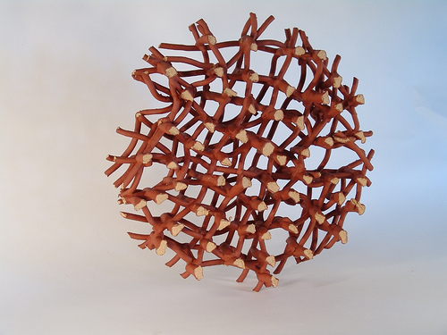
Brian Harper
Oscillation
Ceramic, Epoxy
5.5" x5.5"x 18"

I think that for me, more than anything, is the display of this piece.  I want to be inside that spotlight, in front of that window, in the center of those tangles of ceramic.  I'd like to stretch my hand and arms through the loops and see how the clay feels on the soft skin of the inside of my arm.  I feel like I could meditate in this space, perhaps even with people watching because it feels like a nest, and it feels protected to me.

Lizzie Charboneau: Number 3


Ryan LaBar’s work looks like it is a pile of trash or bits of metal pieced together. However, He has taken large objects made of porcelain and pieced them together in a jumbled way that makes sense and have meaning. He makes abstract shapes, and realistic looking objects like gears, knobs and chains. His compositions often look like a mess and that they are random, but once you read the title, it is more understandable. I feel that this can hinder and help his mission. As a viewer, I was first put off by his work because it didn’t make sense. I was like okay… so he painted gears and warped them and fit them together… great… what is the purpose of this? But after looking at the title of some things, like “Just Don’t Let a Panda Borrow Your Bicycle,” I see the humor and the correlation between the color, shape, and objects in the compositions. I like that he puts a bit of humor in his work, because, let’s be real… you really shouldn’t lend you r bike to a panda bear, but seeing his display of a completely jumbled up bicycle, clearly states why you really shouldn’t let a panda bear borrow your bike, because it would end up looking like this.
As I look through the pictures of his work more, it makes me want to see them in person more and more. The way he positions the piece and the objects within the piece make me want to walk around it, flip it over, look all over it and try to find a treat in it or something. I like that in some works he has perfect geometrical shapes, like cones or tubular circles, and then in others he warps common objects like gears and other mechanical objects.
I am a dancer, and always end up looking at artwork and objects in a form of a dance. Some of his work I find very appealing because I can see the dance that was done in creating the object, and the dance that would be the result of following the rhythm and the movement of the piece. One that I am drawn to in particular is “Jazz Tinged with Sorrow as well as Somber Beauty.” The thick, flowing, black strips of the piece seem like the movement of a dancer as she or he swirls and pushes and pulls to the slow, somber music. The irregularity of the movement seems to work its way around the space like the body of a dancer and contracts into itself in places that I would put a move that has the dancer pull into their body.

Lizzie Charboneau: Number 2


Lesley Baker’s work consists of some pieces that I wish I would have had the guts to make. I have always liked being a “girly girl” and wish that that would have been able to come out in my work more. I have always had a feeling that flowers and hearts on work is “cheesy,” however, Lesley was able to take these things and make them very pretty and some great looking art. 

One of my favorite pieces is the Flower House. It is such a simple looking form and structure, but knowing how clay works and after looking at the structure, I can see that it can be hard to put together, and it makes me appreciate her for her work (I can see this is many of her other pieces as well.) I like that in her work like the flower house, she puts detail in ever inch. The print she has on the flowers is visible on both inside and outside of the flowers, and even on the base as well. I like that the flowers seem to be uniform, but have an organic, unique quality to them.  Another one of Lesley’s pieces I like is the Wall of Sight. The forms she uses are interesting and both something I have never seen before, and something that seems familiar and organic. I really like that her forms seem to be able to work as one object, and fit together to make one big piece at the same time, it is something I think can work really well in a piece or work against it. I think that this works for her, because you can't really tell that they are all smaller pieces that fit together to make one piece. This is also seen in her piece, Fly on the Wall.
 I feel that Lesley Baker has an ability to make things so mainstream and, in a way, cheesy, and make them into very…pretty pieces of art work that give an air of simplicity and elegance as well. 

Tuesday, March 6, 2012

Kevin Anderson


Kevin Anderson

The following artists have a flare for complexity.  It takes an abundance of patience to deal with clay and get the final product to reflect what was intended.  First, is Hans Borgonion.  I have secured two examples of his work, and the first is “Microtubuli XL”, 2008. It is an extruded tube of clay which is then handbuilt to get this beautiful design.  I am drawn to this piece because the natural organic look that he was able to achieve is amazing.  The handling and delicacy required to pull this off is quite a task.

The second example of Hans Borgonion is “Microtubuli x4”, 2008. which was again hand built from extruded clay structures.   I am again pulled to this piece based on the complexity and design component which incorporates two different clay bodies to add a broadening depth  from particular angles.  I also look at this and see an interracial political statement.  It’s nice when a piece just from being viewed can invoke an emotional response.


The Second Artist dealing with many complexity issues is Ryan LaBar.  At the first glance of the photos, I thought these pieces were quite small and how was he able to get them to look so amazing?  But further investigation shows that these pieces are quite large and spacious.  This however still makes you wonder where he was able to get these fired.  Perhaps a very large kiln somewhere.  The first piece is titled “In Chaos, A Moment’s Repose”, 2011.  This stood out to me with his lack of color throughout most of the piece.  The lack of right angle and perpendicular lines gives a sense of flow and endless curvature.  The shadows add to the drama of the piece and the title gives you a glimpse into the artists ideals. 

The second piece I chose was “Anything Can Happen, and Usually Does”, 2010 also produced by Ryan LaBar.  In this one, the colors and trim lines give me a feeling of a ‘system’ that is being propogated.  I look at this and see many parts of life all working together for a common end.  Looks like a mess and that goes well along with the title of the piece.  The color choices are also interesting as many people associate many colors to different emotions.  All together this piece looks like it was well thought out and executed.  This artist is the most impressive I have seen so far.

Kevin Anderson

Here I’ve chosen two arrangement pieces by artist Heather May Erickson made in 2007 by using a mold and slip cast porcelain.  The arrangement is particularly intriguing to me with her use of angles and differing heights that give the pieces a sense of individuality as well as being part of a group and greatly diminished if not with their counterparts.  As pieces of functional pottery, it makes one guess which is for function and which is for decoration.  Using a brilliant white finish leaves interpretations that can range from extremely simple to angularly complex.  I find these two examples to be the most interesting.

“Dessert”, 2007


“Dessert Compotes”, 2007


The “Mallet Shaped Vase” by Harris Deller 1996 is a contrasting porcelain piece.  The technique to create this piece was wheel thrown then altered.   I find it particularly interesting due to the two white intended focal points.  And then to complicate the experience with circular lines working in contrasting fashion to one another.  The lines touching each other are like a fingerprint.  It is fun being enticed to find the all occurring pattern, but being left to not find it.  It could be interpreted as not being completed.  This piece provokes many questions for me and that is why it was chosen.

Next piece of particular interest is “Eat for Two”, made by Gwendolyn Yoppolo in 2010.  It was thrown, and then hand built.  The surface is multiple colors and what appear to be different textures.   Created as a dinnerware piece, I am again taken back by the arrangement of the piece as a whole.   The glazing process really brings out the depth of color.  It appears the handles are significantly different from each other. Perhaps this was intended by the artist, or not, either way it is a very interesting piece.

Thursday, February 23, 2012

White Basket. Victoria Christen. Red Earthenware, casting slip, underglazes, terra sigillata, 19x15x15, 2010.


Looking at Victoria Christen’s work is an obvious way to look at a coil-built form. Her form White Basket is made of thick coils stuck together on a vase-like shape. This piece has the ability to play with light because of all the open space in the form. It is also appreciated as a functional piece since it is able to hold objects and the holes are large enough to hold on to.


Resignation. Andrea Keys Connell. Earthenware, 2'x1.5'x1', 200.


Every artist should be familiar with the human anatomy. However, there are times when artists make a stylized version of the human figure. Andrea Keys Connell creates giant human figures and tends to make then more on the stout side. Despite that Resignation is not the best example of this; Connell’s pieces have so much character to them. Resignation was chosen as an example of a coil-built human torso.


The Infant II. Gabrial Parque. 20x11x12, 2011.


Gabrial Parque depicts baby/fetus-like features in his sculptures often partnered with Christian symbolism. What really intrigues me about these pieces, besides the choice in subject matter, is the detail Parque puts into them. The height of The Infant II is twenty inches and yet the details in the features of the infant’s body are so accurate; down to the wrinkles in the infant’s hands.


Untitled. Ryan LaBar. Porcelain, 2011.


The final piece here is visually stimulating. Ryan LaBar uses a unique style in creating his form. They appear to be a mesh of different sets of mechanical pieces that were molded with clay. The elements flow in a way a mechanical gear should never bend. To me it seems that LaBar never starts with a designed structure in mind, and yet the end result comes out to be beautifully balanced.

Wednesday, February 15, 2012

Kate Snyder: Assignment #3


I like how Ryan LaBar describes his work in his artist statement as “cascading failures”,
because it is a perfect portrayal. It is packed with chaos and looks like
gravity, or some universal force is causing it to tumble in on itself. The
objects in the pieces look as if they are suspended in space, as if to pause in
mid-destruction just to present itself to the audience. A lot of LaBar’s piece
have steampunk qualities to them.


John Chwekun’s work is structurally stressful just looking at it. Using such small and complex
figures to build one object that is meant to stand on its own is no easy task.
The different colors on the terra cotta give the piece a sense of organic
coloring, but not quiet skin like. Also, looking closely the slow progression
of the chimpanzees’ features as they progress further up the piece help the
audience understand that is symbolizes evolution.

Linda Casbon’s handbuilt piece called “Detail of Screen”, made from earthenware paperclay and steel, remind me of a mix between sea barnacles and seaweed. They are very organic
looking and the muddy green look of the glaze makes me think of things that
live in the ocean. Plus, the tubes look like octopus suction cups. Although, the
lines where the ceramic parts are connected easily seen.